Rebranding 2025
Welcome to the Essex Junction Rebranding Initiative
As we embrace our exciting transition from a Village to a City, the City of Essex Junction is taking steps to rebrand itself. Our goal is to craft a visual identity and message that reflects the character of our vibrant community, resonates with our residents and businesses, and attracts visitors from near and far.
Why Rebrand?
Our current logo has represented us for over 20 years, but it does not fully encapsulate the diversity and energy of Essex Junction today. The Rebranding Committee, consisting of City staff, a City Council member, and community residents, is collaborating with Place Creative Company to develop a new identity for Essex Junction. This initiative goes beyond just updating colors and fonts. The new identity aims to be more inclusive and better represent the Vermonters who live, work, and play here.
Rebranding Update December 2025
City Council Progresses to Round Three of Rebranding Project
The Rebranding Committee is making significant headway in its community rebranding efforts. It recently presented the third round of proposed logo revisions to the City Council during the December 17 meeting.
The Committee initially presented seven brand identity options to the Council at the November 12 meeting, recommending that Concept A move forward for further refinement. The Committee felt that Concept A reflected the feedback gathered from our community survey and Discovery Session which inlcuded a brand that reflects progress without pretense as a growing, diverse, and inclusive community, resonates as both a community with deep roots and forward momentum, is warm, energetic, thoughtful, welcoming, confident, and vibrant, and conveys connection, a place where people, paths, and ideas meet.
Following Council input, the Committee reviewed several changes, including an updated, brighter color palette, explored icon variations with the Five Corners intersection in different positions and scales, and various typography adjustments for readability and impact. Additionally, they explored what the logo would look like in a single color and in black-and-white variations, as well as the increased prominence of the word “Junction” within the design.
After evaluating the latest alternatives, the Committee concluded that the original logo icon—featuring an off-centered, zoomed-in Five Corners—and the initial color palette best represented the community’s identity.
At the meeting, the Council reviewed three logo versions: Concept A, where the text “Essex Junction” is set to a single font size; Concept B, which uses all capital letters; and Concept C, the original logo concept with a capitalized “E” and “J.”
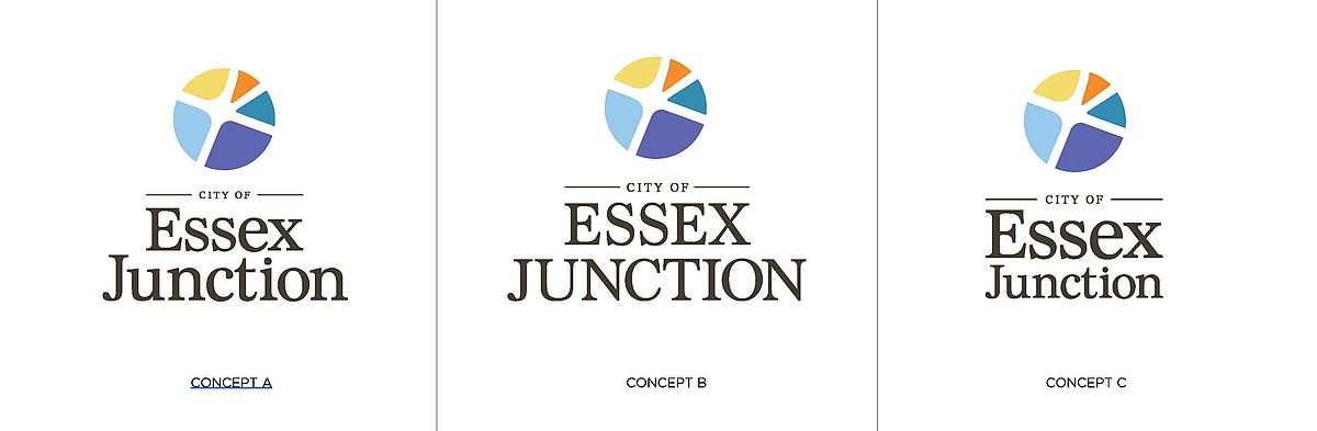
Although two more rounds of revisions remain, the Council has expressed a preference for Concept A and the tagline “Where it All Comes Together.” The Rebranding Committee will now work through the final two rounds. It will provide a final logo to the City Council in January or February.
Rebranding Update November 2025
Rebranding Committee Unveils Design Options to City Council
At the November 12 City Council meeting, the Rebranding Committee presented the Council brand identity options developed by Place Creative Company. During the presentation, the Committee showed the seven identity options, which include a logo, tagline, color palette, and examples of how the logo would appear on products. Below you will find the full presentation, descriptions of each design, the Rebranding Committee's recommendation to the Council, and our next steps in the process.
Each design reflects the feedback gathered from our community survey and Discovery Session. Our goal was to create a brand that
- Reflect progress without pretense as a growing, diverse, and inclusive community.
- Resonates as both a community with deep roots and forward momentum.
- Is warm, energetic, thoughtful, welcoming, confident, and vibrant.
- Conveys connection, a place where people, paths, and ideas meet.
Below is a brief description of each option.
Design Option A: This design is based around the idea of convergence and connection. The logo mark is both literal and abstract in how it represents the Five Corners, offering a sense of place. With a nod to history, the typography is a little more traditional, but the logo as a whole has a contemporary vibe. The color palette is warm but optimistic. The tagline is: Where it All Comes Together.
Design Option B: This design is a wordmark exploration. The overlapping letters speak to connectivity and energy in a fun but approachable way. The color palette is warm and vibrant. The tagline is: Connected to Community.
Design Option C: This design leans into the heritage and architecture of the area. The shape of the mark is a centered monogram that creates a placeholder for the City of Essex Junction. It has a contemporary undercurrent, with a simple but bold color palette. The tagline is: Centered Around You.
Design Option D: The design is all about connectivity. The mark conveys a sense of things coming together, while the unique points of connection are energetic and catch the eye to drive interest. The color palette is vibrant and energetic. The tagline is: Bringing it All Together.
Design Option E: This design is all about centeredness. It is not a literal Five Corners, but the mark is an energetic burst that speaks towards a community that is at the center of it all. The color palette includes a bright, energetic green as an accent color, but it is anchored by a calm, cool blue. The tagline is: At the Center of it All.
Design Option F: This design leans into the sense of heritage and history, but in a contemporary way. The mark is designed to feel at home within the architecture of the community, but it is also an exploration of how the community refers to the City, using JCT as a focal point. The tagline is: Small City. Big Heart.
Design Option G: This design speaks toward community, centeredness, and coming together. The shape of the mark has an almost quilted pattern with a balance of warm and cool colors. The arrow shapes of the design are all about connections, both to the center of the City and from the center, as an access point to many destinations beyond. The tagline is: Vermont’s Neighborhood City.
Committee Recommendation to Council
The Rebranding Committee recommended that the Council move forward with Concept A. The Committee felt that Concept A offered a modern yet grounded direction that respects both the City’s heritage and its forward momentum. The mark is distinctive and ownable, designed specifically for Essex Junction through an abstract interpretation of the “Five Corners.” It carries that subtle, insider quality — recognizable to those who know the City while remaining visually appealing and accessible to all.
The typography strikes an ideal balance between contemporary and traditional. The chosen brown for “City of Essex Junction” complements the mark by bringing in a sense of history and craftsmanship while feeling thoughtfully modern — a deliberate choice that elevates the design beyond the simplicity of black.
Symbolically, the intersecting forms within the logo can represent the City’s defining roads or neighborhoods, reinforcing its sense of place and community.
Concept A embodies where Essex Junction has been and, more importantly, where it’s going. The Committee also believed that Concept A was the most honest reflection of the community feedback we received during the process and that it captured the vibrant and connected spirit of the community that consistently emerged.
Finally, the Committee recommended the tagline Option G: "Vermont's Neighborhood City" best reflects the City and its sense of neighborly connection and the Village mentality.
During the meeting, the Council provided feedback on Concept A that you will see in the next steps section below. They also asked to hold on a tagline decision as some Councilors preferred Option A: "Where it All Comes Together" and Option F: "Small City, Big Heart."
Next Steps the Committee Suggests
Some of the ideas to explore in the next round with Concept A that were discussed by the Committee and Council include:
- Explore an updated color palette — incorporating brighter tones inspired by other design directions.
- Adjust the composition so that the Five Corners intersection is centered within the circular frame.
- Create a version using the same typography but with a capital “E” in “Essex” for comparison.
- Make the word Junction more prominent in the design.
- See what this design would look like in a single color and in black and white.
The Rebranding Committee is now working with Place on the next few rounds of revisions over the next few months. The next version of the logos will be presented to the Council at their December 10 meeting. The goal is to present a final logo to the Council in January/February.
Rebranding Update October 2025
In June, the City contracted Place Creative Company to develop a brand identity. In July, the Rebranding Committee participated in a Discovery Session with Place aimed at establishing a shared understanding of our vision and project goals. During this session, the Committee reviewed brands that inspired us, explored different types of logos, wrote Google reviews for the City, and discussed the City's brand persona.
In September, we launched a community survey in conjunction with the Meet Me on Main events, which lasted for two weeks. The Committee also attended two of these events, where they asked some survey questions in person. Altogether, the City received 272 responses from both online and in-person participants. Congratulations to Jacob Porter, Maria S., Bella Joly, Nichole Guntulis, and Michael Membrino, who were our winners of the $50 Hannaford gift cards. Thank you again to Weston & Sampson for their generous donation toward the gift cards. A summary of the survey results can be found below.
The next step in this process was the development of a Project Brief. The Project Brief will guide Place’s creative team as they develop brand identity options. It outlines the project scope and highlights key insights gained from the survey and the discovery session. The top section of the document serves as the Brief that the design team will use throughout the creative development process, while the bottom section includes important takeaways from both the survey and discovery session. The Project Brief was reviewed by the City Council, Rebranding Committee, and City Department Heads and can also be viewed below.
Next Steps:
Place will now begin developing identity options. They will present these options to the Committee, and subsequently, we will present them to the Council. The Committee will have five rounds of revisions on the selected identity option.
Below is a brief timeline of the next steps in this process. Please note that this timeline may change based on the complexity of the requested revisions.

Stay Informed
Check back to this page for updates and progress on the rebranding process. If you have any questions or need further information, contact Ashley Snellenberger, Communications and Strategic Initiative Director, at asnellenberger@essexjunction.org.
Join us on this exciting journey as we work together to create an identity that makes us proud to call Essex Junction home!